Have you ever come to a situation where you find a website and go like – Wohhhhh.
Ask me, I have in that situation for more than I can imagine.
That’s the beauty of the web. You are more likely to stumble upon few masterpieces.
This is what I found when I was in the research zone for one of our clients.
I was so inspired by some of the designs that I had to make a post of it.
Here are 10 Ecommerce web designs that will really catch my eye and lingered in my heart:
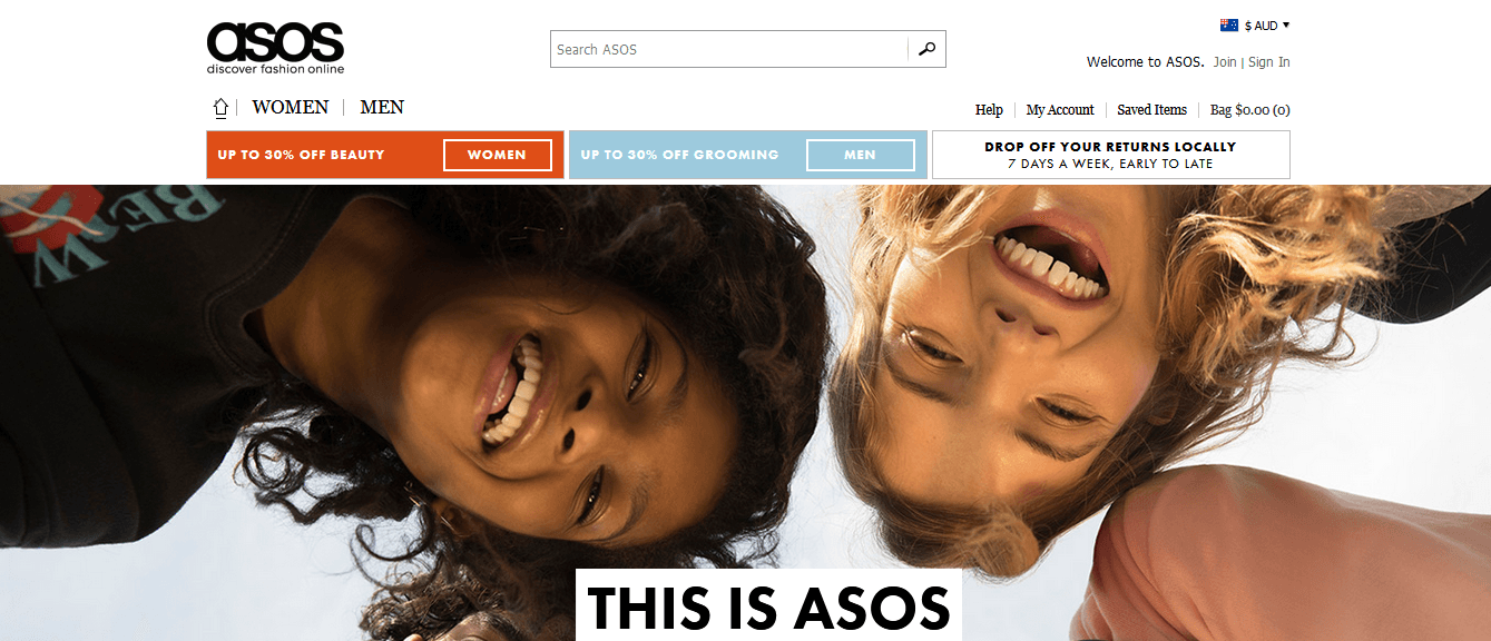
Asos
This UK based Ecommerce agency takes user experience to different level. It doesn’t stretch content to make a hang of it. It keeps everything simple with easy navigation and graphics that really hits the mind. One of the best things about it is its layout. It doesn’t extend the homepage layout with excessive materials.
It’s targeted demography is young adults. So, it makes sure the visitors can go to men and women section with one single step. Special offers like discounts and sales are always kept on top with an attractive colour that catches the eye.
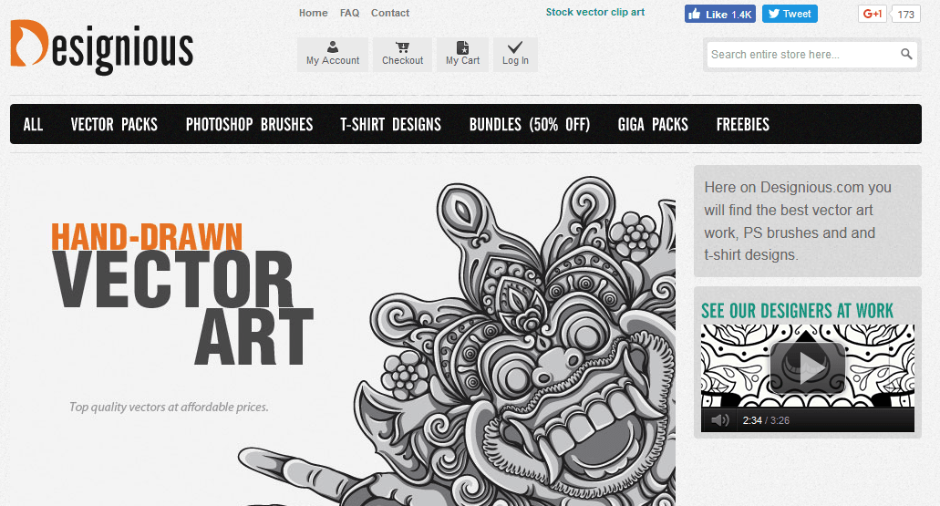
Designious
Designious – isn’t the name catchy? It just stuck in my head as soon as I listened to it. Designious is an E-commerce retailer that specialises in vector art, t-shirt designs, and Photoshop brushes. A beautiful graphic of vector art in banner makes it every so interesting.
Using bold interface it makes sure it catches the eye. Just like how every other marketer would do it has placed its top client’s logo above the fold. It also gives you a tour guide of their work right in the sidebar which acts as a glue for clients.
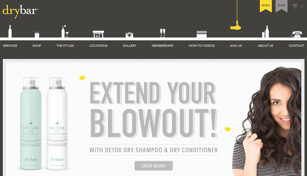
The Dry Bar
The moment I entered into this website, I was greeted by a keep in touch pop-up. For many, this could be annoying but as a marketer, I thought this could be one of those tricks that could pay off. After all, you need email subscribers right? Then why not get them right from the start they enter your site.
In navigation, you can see icons of every menu elements which is a brilliant concept of user experience. I was so hooked that I had to send an email to this guy to say how much I loved his website.
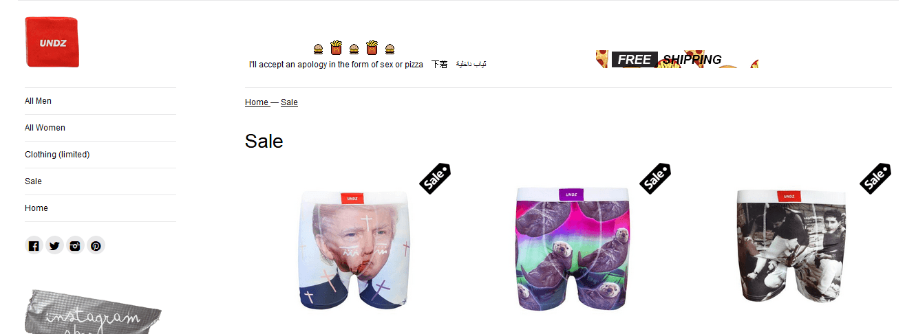
Undz
First of the name is what got my attention. I won’t lie about it. I mean who says underwear? We all are about undz, right? So one point to its creative name. The site doesn’t take a lot of stress to navigate through. You can just sit back and analyse it with a peace of mind. You will get underwears of any sex with images that really get in the mind. It breaks every rule of great design concept by throwing everything at random. But, hey! It works for them.
Bill Blass
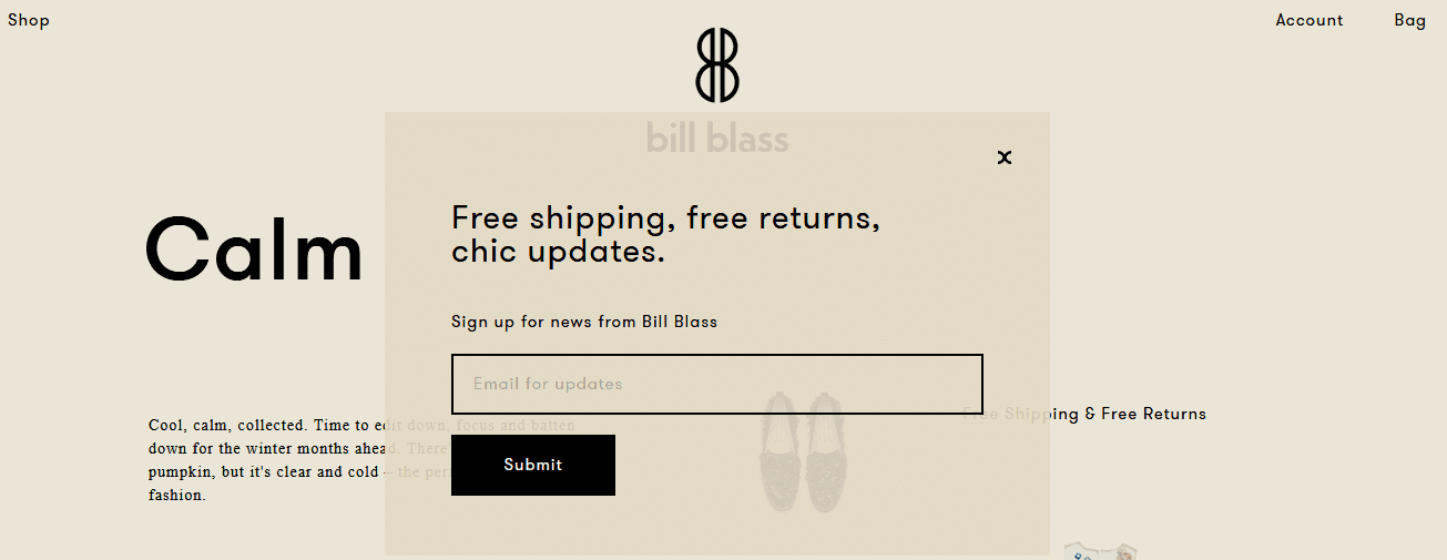
Bill Blass does a wonderful job by hooking visitor with a pop up that simply says free shipping and free returns updates. If you were a buyer, wouldn’t you love this?
This site comes with a parallax layout that takes shopping experience to next level. I have never enjoyed this much looking at an attire shopping site. Usually, I don’t prefer these websites. But Bill Blass changed my perception by simply displaying products in separate boxes in a way that it all looked like one big image. This is a fresh and different approach to beautiful colour scheme making it ever so beautiful.
Punch Drunk Panda
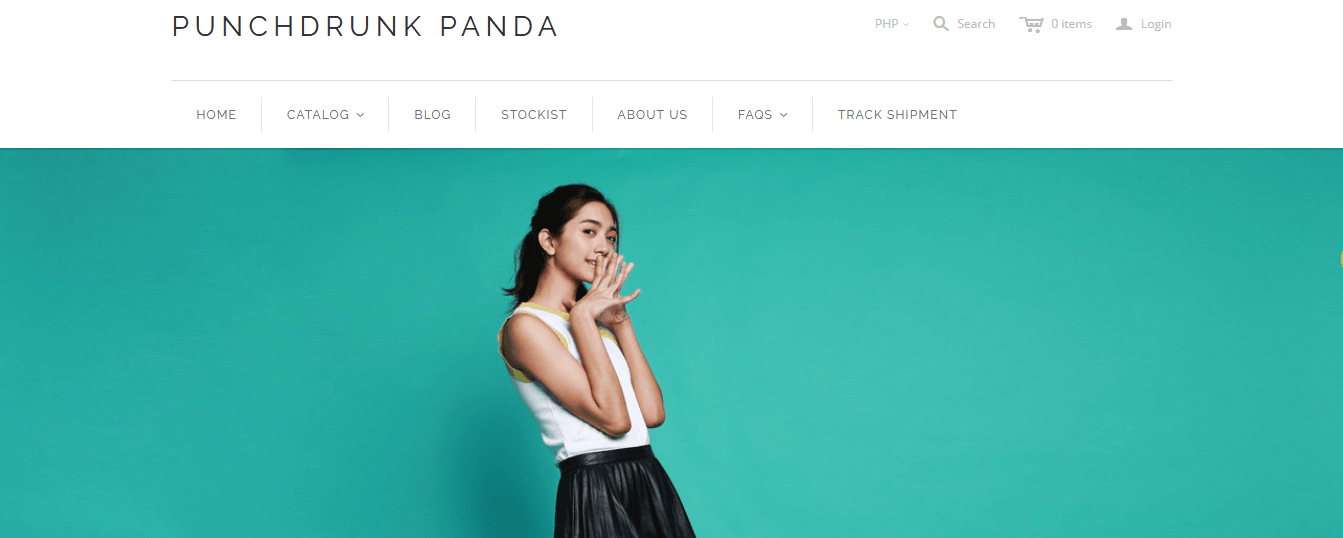
Punch Drunk Panda – what an unusual name, right? I guess this is how I got into this website. This is a Philippines-based online store that keeps the website as simple as it can get. It’s no way to the usual Ecommerce online store you will see on the web. It just has one big image that covers the size of the screen with a CTA button in a red ink. From iPhone cases to shoes, they spread positivity with cute graphics and simple layout.
A Book Apart
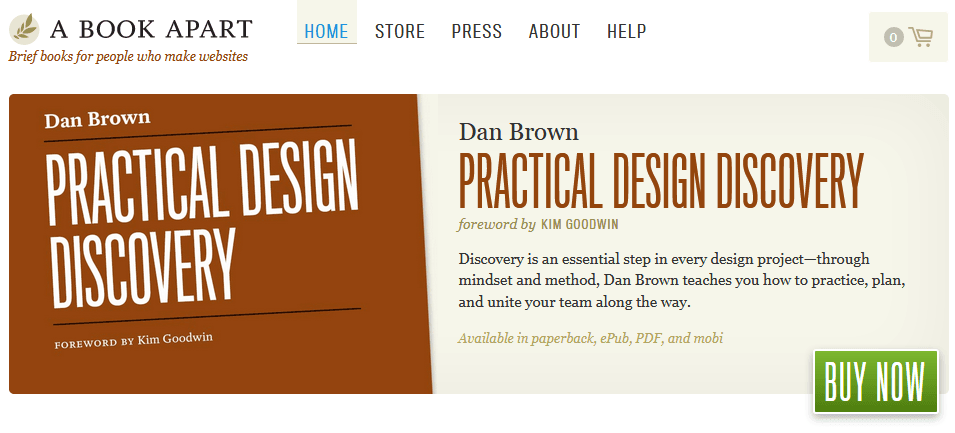
You know what I like the most about this website? It’s quest to take risk and cross question the stereotyped figure. While every other E-commerce sites take images as their soul. It doesn’t rely on photography to sell its products. Instead, it uses a plain cover with title and briefs of the book. Also, it uses the colour combinations brilliantly so it doesn’t look like the same old thing. Yes, the CSS transitions on the main book section are absolutely amazing.
Coke Boys
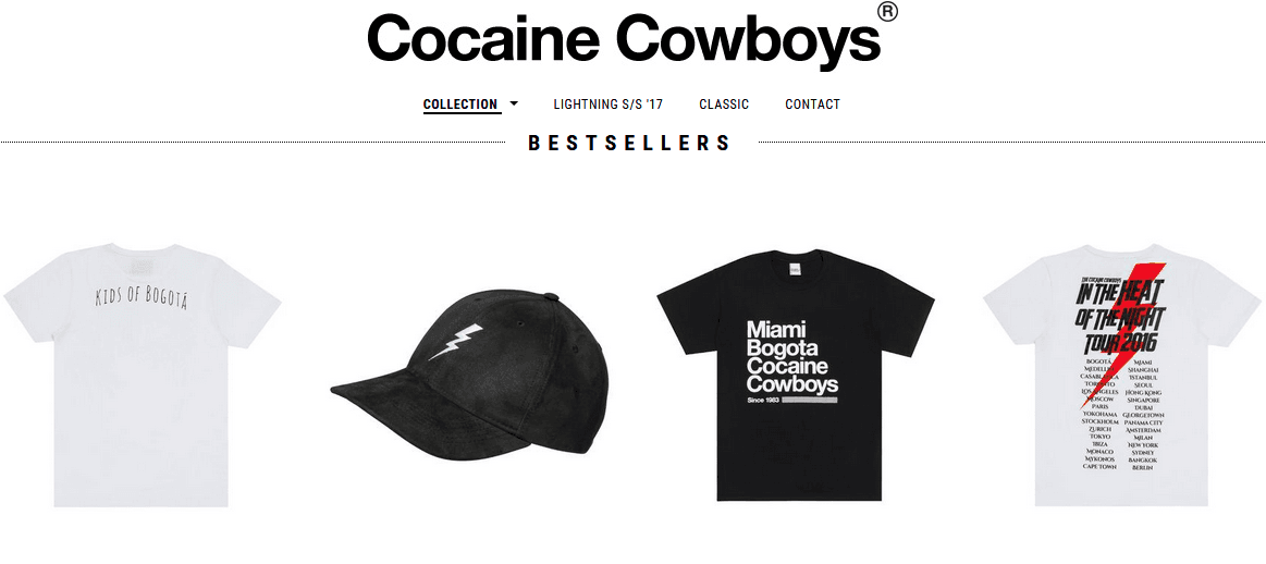
Coke Boys better known as Cocaine Cowboys adds a grin to your face when you visit their site. This Berlin-based company takes quirkiness to a different level. You can clearly see from their site that they don’t give a damn about anything. It’s for bad boys so if you are a good boy, you may not want to enter here. Their pedal-to-the-metal approach is all about offending people and getting negative buzz around the web. This is all marketing folks! And as a marketer, you would love this.
Bellroy
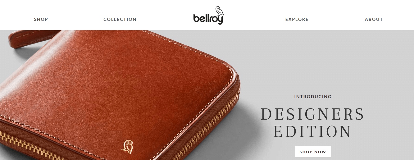
A fun interactive demonstration is what defines Bellroy. It’s a wallet making company that offers a sleek user experience with an image of Wallet up front in the homepage. It doesn’t pour with too many information all at once. Instead, it keeps everything simple with a wide variety of designed pages focusing on individual products. It’s clean and minimal design lets me scroll through the site easily which is another beautiful feature of this website.
It has got a wallet for everything – your keys, your phones, you name it. Hey! Don’t you think wallet needs a change?
ShWood
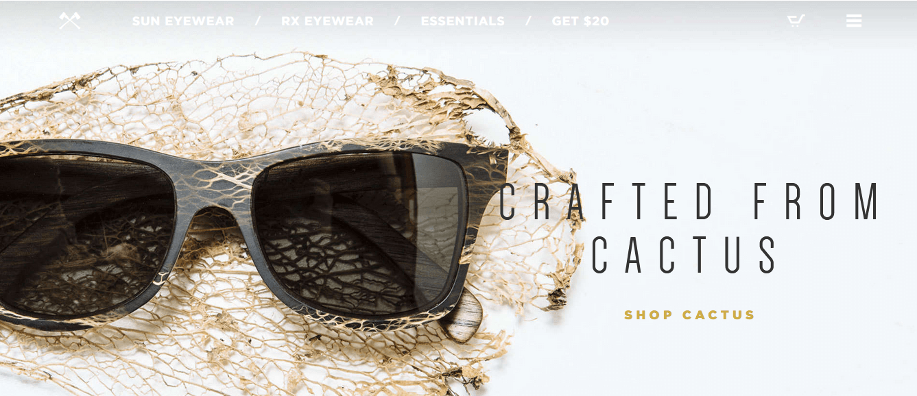
I’m absolutely in love with this website. When you visit this website, you instantly want to buy a sunglass even if you aren’t in the mood. It offers such ambience that you can’t resist. A great video that has been used a hook to attract visitor is simply majestic. A glass that matches with a skull like graphic also shows how uniquely the website has presented its content. Product collections are configured in strip format where the visitor can filter by style. It gives quick access to particular style without hindering the experience.
Closing Down
So what are some important aspects you can take from these Ecommerce websites? They all have 3 elements that define their brand: Strong value proposition, clear promise, and problem-solving. So to stand out from the crowd, you should make sure you meet these 3 components. You ready to do it.

