Websites have become one of the most crucial parts of every business today, there’s no doubt on that. From small sized business to larger entrepreneurs, every business has got the most attractive business website for their business which works as an online representation of their business and brand. If you are an owner of a small business and want to build an online presence of your business then, you need to build a website with latest web design trends.
Table of Contents
- Why small businesses like yours need to have a website?
- Most effective small business website design checklists for Simple, user-friendly design
- Visible contact details with prominent contact links
- Use of GIFs and animations
- Great emphasis on content
- Page loading speed
- SEO optimised design
- Numbers: They are effective
- Is your design mobile friendly?
- Blog do create magic
- Proofs
- It should give a clear picture of what users can expect
- Content Structure should flow with design
- Easy to Navigate
- It should resonate with your ideal audience
- Don’t fall into static trap
The prospect for web design is continuous; it’s your job to determine the design trend that is going to stay on trend in future too. Many small business owners are found confused and stuck, they have no idea from where to start and are terrified by the process of building a website. They might think spending money on a website is a huge investment and is out of their budget. They might be happy with a Facebook page and think it is more than enough for their online presence. But, the truth is, professional websites are the only way to start promoting a business.
Though designing a website for your small business can be a daunting task for you, but it is surely a worthy and the best investment that you are ever going to make for your business.
Why small businesses like yours need to have a website?
People, these days, they prefer to search products online before going for an actual purchase. That’s the reason; almost all businesses have succeeded to bring their business online and are working hard to improve their business online presence. And if you don’t have a website for your business then, you are losing lots of your potential customers and your business.
Businesses who are selling their products through online, it’s obvious for them to have a website for their business. But, if you don’t sell your products or services via online, then, having a website for your business can be your online representation of your business. Many of your potential customers are online and they can get information about you and your services through your website. Your website can work as an extension of your business card with all the necessary information about you, your services, products, and your physical location and so on.
So, having a website for your small business can bring you lots of benefits, without any need of special attention. More than 90% customers conduct online research and go through reviews before buying any products or before signing projects with any company.
Now, you have already known how important role a high-quality website plays in today’s business world. It can be the main source to market your company, attract your potential customers, draw in new leads, bring in more sales and increase the revenues of your business in the long term. To push your business leads and continued growth in the market, you need to design a website that not only improves your business for the short run but, also generates more leads, attracts more customers and increases revenues of your business in the future too.
To help you get a website that stands out in 2023 and help you to grow your small business bigger, we have come up with a list of essential small business website design checklist for 2023. The following small business website guidelines will help you to design an awesome eCommerce website for your business in 2023.
Most effective small business website design checklists for Simple, user-friendly design
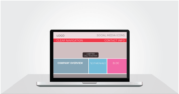
Simple and user-friendly websites have always been popular, be it years back or now or in coming days. Users love websites which are simpler and easier to use. Some of the designers end up designing their websites more complex for users while trying to make it different and unique, which is not good in terms of user experience. A simple website with easy navigation menus, simpler layout with important information in it is what users actually are looking for. And if you could provide all of these things on your website, trust me, you are going to get returning visitors on your website. So, like previous years, 2023 is surely going to prioritise websites with simple and user-friendly web design. To learn more on UX, take a 5-minute look at guidelines of UX.
Visible contact details with prominent contact links
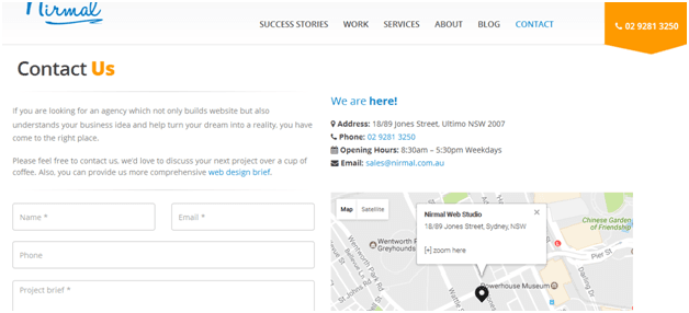
For small businesses, this is a must to include points on your website. Once you are done with your company name and the services that you offer, you must not forget to place your business info in the visible place on your website so that your visitors can easily spot your contact details and contact you to get help. Having your business information like your local address, phone number, email address, etc displayed on your website works as a virtual guarantee for your potential customers and ensures them that you are a legit business offering services.
Use of GIFs and animations

Source: WIX
GIFs are going to gain more popularity in 2023. You are going to see more sites using GIFs and animations to lure visitors and compelling them to stay on their sites. GIFs and animations are one of the most effective ways to give a sophisticated touch to any website. It not only makes your website lively, but it also helps communicate things easier and quicker than any other media, be it images, videos or texts. Using it, you can give your website pretty unique design elements. A simple GIF or animation will surely come in your budget, so consider having it.
Great emphasis on content

In 2023, websites are likely to give more emphasis on content. Content will be more focused on users than search engines. Web sites are considering to put more focus on their website content, be it by removing all the distractions such as sidebars, banners, ads, popups, sign ups, etc that they have been adding in recent years or making them take up less space. It is yet to be determined. If you make your website content informative and engaging, providing all the information about you, your services, products, whatever your potential customer might look for will be prevalent moving forward. Focus more on content this year.
Page loading speed
This element is the only part of a website’s user experience which will remain the top priority forever. They are on top consideration in search engine algorithms. Search engines rank sites that load slowly lower than their competitors who load faster. Research has also shown that if a website does not load in 2 seconds, 47% of users will ditch the website and 40% of the consumers will not return to the website after having a negative experience. 53% of the mobile users leave sites that take more than 3 seconds to load. So, if you want your potential clients to browse your website and make them visit again, then you need to work on providing them with a great user experience with a speed website. Make sure that your website loads within 2 seconds.
SEO optimised design
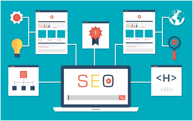
Imagine you bought a new car, isn’t it great? But, what if you don’t have fuel to run it? Pretty worst situation huh? Likewise, having a website only does not benefit your business if it does not show up in the SERP. A website without ranking is similar to a car without fuel, and in this world of the search engine, more than 90% people search online for a product or services. Having an SEO optimised design website can help you to a greater extent in 2023. Every small business should pay more attention to the key SEO tips to run their business successfully.
Numbers: They are effective
First: Our services reduce your inventory cost.
Second: We decrease your inventory cost by 30%.
Which one sounds concrete and convincing? The second one, right? There’s no doubt on that.
People tend to be convinced by benefits that are specific and concrete. Try to persuade your potential clients with numbers. Numbers are the best method to project confidence. Let us take another example; we have years of experiences in fixing cars. The next is we have fixed 100 cars till now. Which is more convincing? Obviously, the second one.
Is your design mobile friendly?
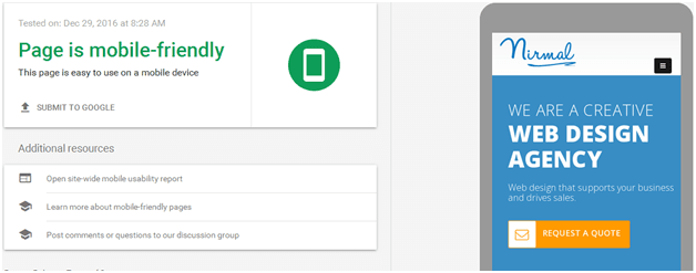
Mobile friendly websites have gained a special spot in both users and Google’s heart. After Mobilegeddon of April 21st, 2015, Google has given special preferences to those sites which have made their websites mobile friendly. This special treatment is going to continue in 2023 also. The next reason to have mobile friendly design is, more than 60% traffic on the internet comes through mobile. More than 85% of user today, they search the products or services online before going for an actual purchase. If you want to benefit your small business then, design mobile optimised website.
Blog do create magic

Content is the king, you must have heard this. If you are a small business entrepreneur, then you probably must have heard about the content marketing, right? And a small business blog is the best marketing tool that you can use for your benefit. It has been proven that business that uses blogs get 67% more leads than the business that does not. The successful small business entrepreneurs get tonnes of business and engagement online through their blogs. They know how to utilise their blogs to build an online audience and keep them engaged with their brand. Companies that blog has 97% more inbound links than the companies that don’t. Many small businesses make their biggest mistake by overlooking the potential rewards that blogging can provide. We recommend you not to be one of those.
Proofs
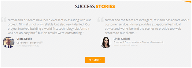
People like proofs. They immediately believe the words told by fellow customers than the words that a website brags about themselves. They want to hear from the other people directly and know whether their experiences. According to BrightLocal, more than 90% consumers read online reviews and nearly 88% say they believe those reviews. So, small businesses should have a portfolio section with client testimonials on their website. These two sections display your company’s performance and help your business to get potential leads. While adding a testimonial of your previous client, don’t forget to link out to their website and social media pages. This can help you improve your SEO effort as the highest quality links your website offers, the higher search engines will rank it. So, try it.
It should give a clear picture of what users can expect
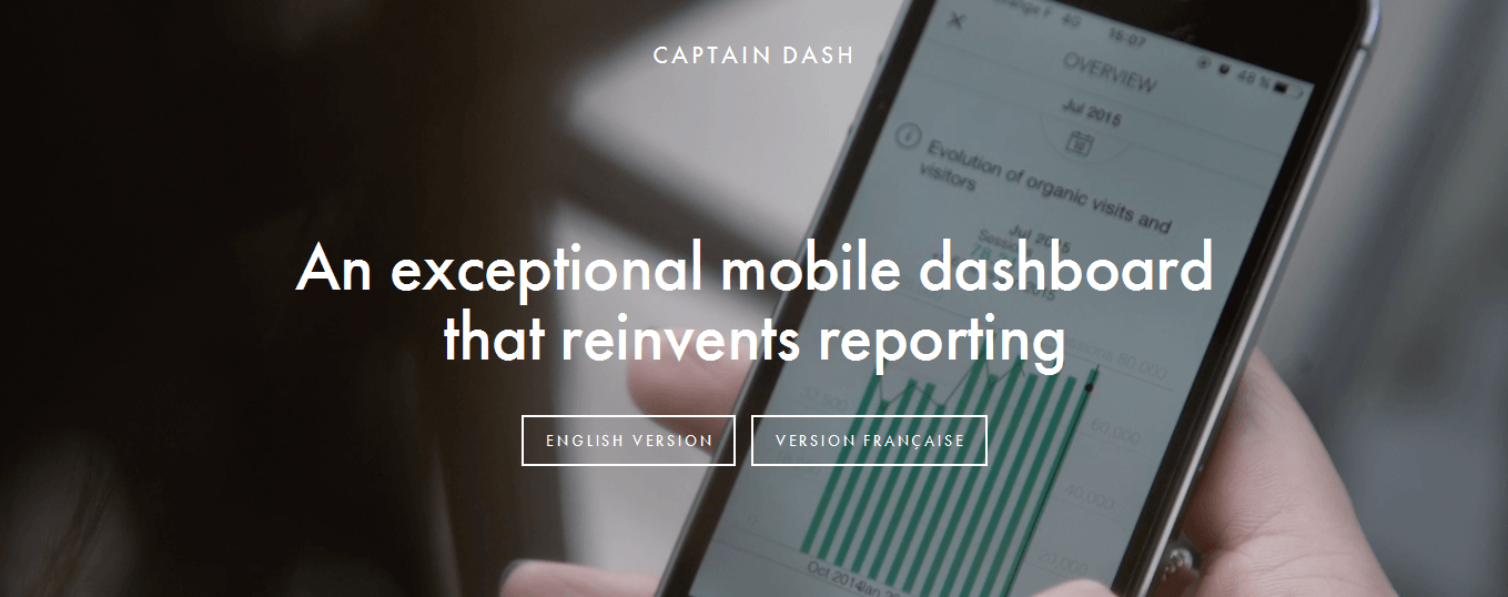
Being worked with a tonne of small business, I have developed an eye that tells me what’s going wrong in a website. Most of the business owners or design agencies fail to explain the USP (unique selling proposition) of a website.
You have pushed your users to the door and you start selling them by explaining about yourself. Trust me; they don’t care about “Who you are.” All they want to know is if you have the solution to their problems. Start your headline with how you can solve the problems. If you can deliver it, users will turn into customers.
Content Structure should flow with design
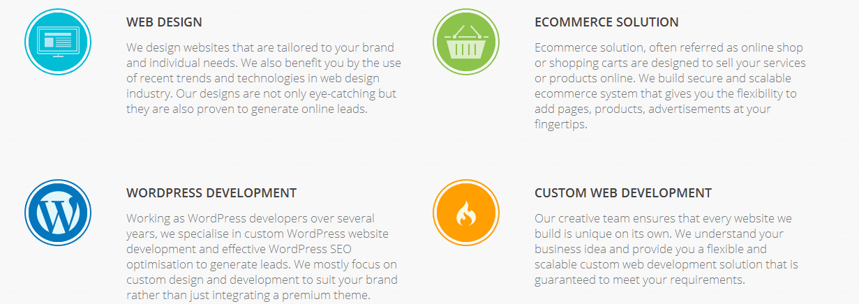
I have seen many websites where I do nothing but sit back, and have a good laugh at it. No, I’m not trying to make fun of anyone. But, the design and content come out horrible for few businesses. Your content structure should follow a natural pattern. Don’t get moved by SEO too much that you push content way more than your site can take.
The typography and design should resonate with your brand. A user should be able to distinguish between your major information. Make content structure highly consumable.
Easy to Navigate

Don’t make users search for the necessary information. You only have 3 seconds to turn your users into qualified leads and funnel down into loyal customers.
Follow left to right rule. When users enter your website, they navigate from left to right. Keep your logo on the left side and important pages on the right menu bar.
Give a clear picture of what users can expect when they click on a button. Don’t put them on a doorway trap of showing something else and delivering completely different. Every section of your site should have a compelling value proposition with the call to action that demands attention. Instead of using a generic call to action goes for action oriented CTA. For example, if you are selling free trial for a product, don’t use something like” click here”, go for something more action oriented like “sign up for a free trial.”
It should resonate with your ideal audience

Ideal audience is the one that is most likely to buy from you. I will not go through the process of building one as there are various guides that detail down the persona creation and matching the right fields. However, your website should have resemblance with your target customers need. Try to eliminate fluff and speak in the language that your audience use. Your communication skill is a key factor on converting your users. Your website should have the ability to communicate with your customers.
Don’t fall into static trap

The Web is evolving every day. I have seen small business owners not picking up from what they started a decade ago. Still, they are using ugly HTML templates that even a Grandpa would hate.
Your website should be adaptable. Mobile trends have grown rapidly, so your site should be fully responsive. You should keep testing your layout, design, and content integration to generate more conversion.
Although small business and corporate business principles look kind of similar, there is a vast difference in design and content. Small businesses don’t have to deal with complexities of corporate business. However, if you can’t leverage the principles properly, you will still miss clients on regular basis.
Finally, Websites are affordable than you think,
It is so surprising that there’s still many small businesses with no business website as more than 90% of business purchase decisions are made with SERP result. Many of the small business owners hesitate to take steps towards building a website for their business because of their limited budget. According to research done by UK web geeks, Budget has always been one of the main reasons behind Small business owners being reluctant to design their website. Well, there’s tonnes of web design agencies out there, who offers best web design services at a very reasonable price meeting your budget. If you have no idea about above-mentioned tips, then I would like to advise you to find the most reliable web design agency and let them handle your business website.
Can we check some essentials for you?
Have you recently built a website for your small business? If so, please feel free to share your website link in the comment box below. We’d love to check it out.
Nirmal has more than 12 years of experiences designing websites from a startup business to larger enterprises. We have web design plans for each business size and we would love to work on your project. Are you looking for small business web design in Sydney? We have got the right plan for you. Just contact us via online or simply call us at 02 9281 3250 today! Your satisfaction is our first priority!
