So some of you may be thinking what’s typography. And for some having a grasp of it may be thinking why Typography?
Well, it is one of the essential components to drive the path of web design safely. Yes, Typography is very important part of any website design and development. In fact, it is the most important basics of any design project.
Most of the website designers are repeatedly intimidated by typography which consequence in bland typographical design or web design always to use one or more reliable typeface in their project.
Since you are here I’m presuming you are new to the world of website design and willing to learn typography.
So, let’s dive into typography tutorial for beginners.
Now, let’s start with the introduction
What is Typography?
Before proceeding to the tutorial, you need to know what typography actually refers to.
Let me explain.
Typography refers to the art and technique of arranging letters, characters. It is more focused on the fonts and arranging the letters and characters in the perfect way which includes line length, spacing and both single line all over the complete page.
Using clean and simple to read font types are the crucial part of any presentation. If you pick up small font all cramped together, then your presentation will surely not be desired. It is awesome to have a beautiful project, but that should make your audience understand what your presentation is about.
Basic components of Typography
Do you think typography is limited to font colour only? If you think so, you might be wrong as in actual it is more than that.
Most of the elements of typography are essential and manipulate the way your page reads. Most of the users concentrate on fonts and typefaces that cover leading, tracking, kerning that comes up with the remarkable and useful outcome.
Check out the basic components of typography:
Typefaces
They are certainly the simplest component of typography and refer to the name of text style employed.
Fonts
Do not take font as the only style designed in Time New Roman, Arial, Cambria and more. They enclose on both specific typeface and the width and height decided by the typeface.
Tracking
Tracking includes the space between the characters within the text. It mostly refers to the letter spacing along with a ‘pretty’ standard, but it can be adjusted to influence the text density.
Kerning
Kerning is alike tracking but rather than referring to space alone it specifies the white space within the characters and letters.
Line length
You must have guessed about line length after its name. Well, it is the length the text runs right to left or horizontally, all over the page. Also, it can be updated regulating the margins of the page.
Leading
Are you aware of leading? It measures the space better where the letters are situated. Simply put, it measures the distance a line of text and the line straight to it and below it.
Is Typography important?
In today’s digital landscape most users are familiar with the design, typography and the way it appears. Yes, Typography is important and you can find it everywhere. Just turn around and look at a billboard, your mobile device or even the different style on a website.
Each letter, font, the character holds essential role to determine how the message is delivered from one place to another. Good typography is useful that lets users focus on content more than formatting. In fact, fine typography design frequently becomes ignored as it just makes sense.
You can find lots of typography available and pick the right one can be a daunting process. So, let’s talk about the main types of fonts.
If you use typography properly, it can express certain feeling or mood. The user should understand the type of message you send and with suitable font sets, you can make your presentation more useful.
Besides, using various font types and sizes, the users decide the most significant points of your presentation only by the observation. This makes it simple for users to go after and focus more on the presentation.
You can also go for the cool fonts that are free to download
Here we go:
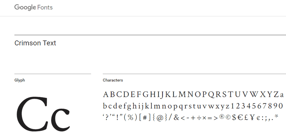
Crimson text
Crimson text is ideal for body copy and was intended for book production. According to Google Fonts, it is simple and easy to understand.
Here, you can find old style figures, small caps and math characters that make it more special and useful. The theme appears in three styles and they are regular, light, and bold together with italic styles of those weights.
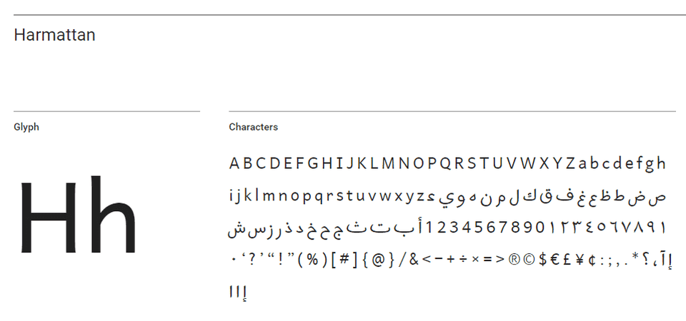
Harmattan
The Typeface on Google Fonts Harmattan is truly intended to go along with Arabic scripts. Yet, they also appear good in Latin characters and looks striking in either headline or body copy.
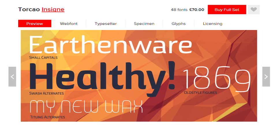
Torcao
Torcao contains the unique combination of the letter which is half circle and the half square, strong and technical also at the same time cheerful and welcoming. This font ideal headline style is still readable in longer text. It appears in nine weights with both strong as well as extender choices to accomplish the set of forty-eight fonts.
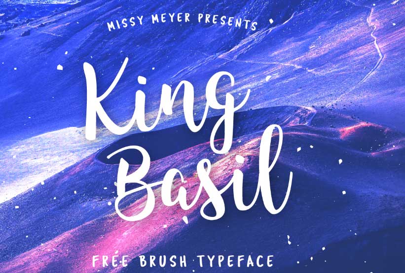
King Basil
Free brush font Kind Basil is placed in Behance which is ideal for business materials such as social media images and flyers. You also can take it as a Lite version of Full King Basil designer and enclose lots of swashes that connects letters for striking, script-like font.
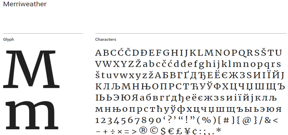
Merriweather
Merriweather is developed to be a beautiful and simple to understand typography ideal for your homepage or blog. Also, it is an enduring venture on Google Fonts and is efficient as well. Presently, you can find four different styles, light, bold, and black together with italic styles of those weights.
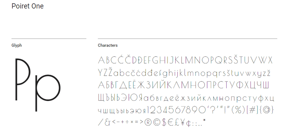
Poiret One
I love Poiret One, you can see the description on Google Fonts. It is fresh, decorative, geometric grotesque with the indication of Art Deco along with constructivism.
Also, the font type is sleek, simple and stylish which is truly ideal for short texts. It is best to be applied on larger signs, labels, posters, titles, T-shirts or headlines.
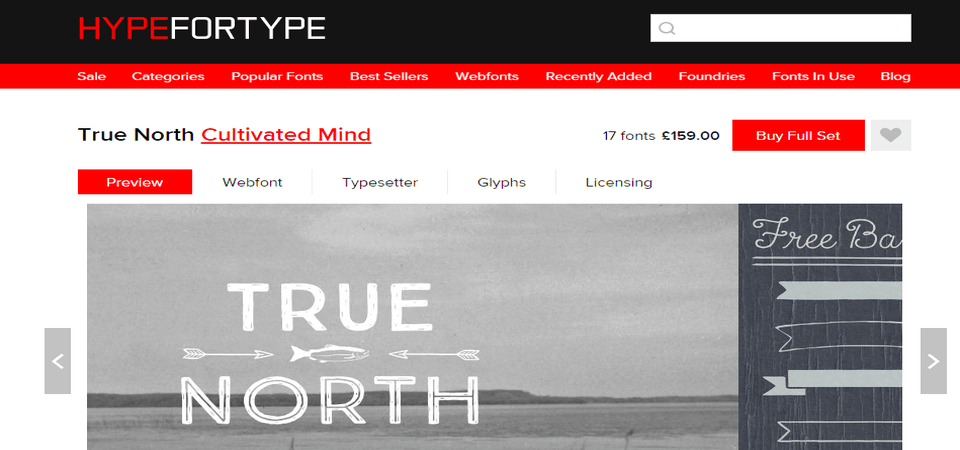
True North
True North is a vintage inspired headline typography that holds sixteen different styles together with monoline script. The typeface also contains free labels along with additional icons such as numbers, symbols, tools, wild animals and more.
The typography type True North is the headline with different capitals that appears with extras, free banners and labels.
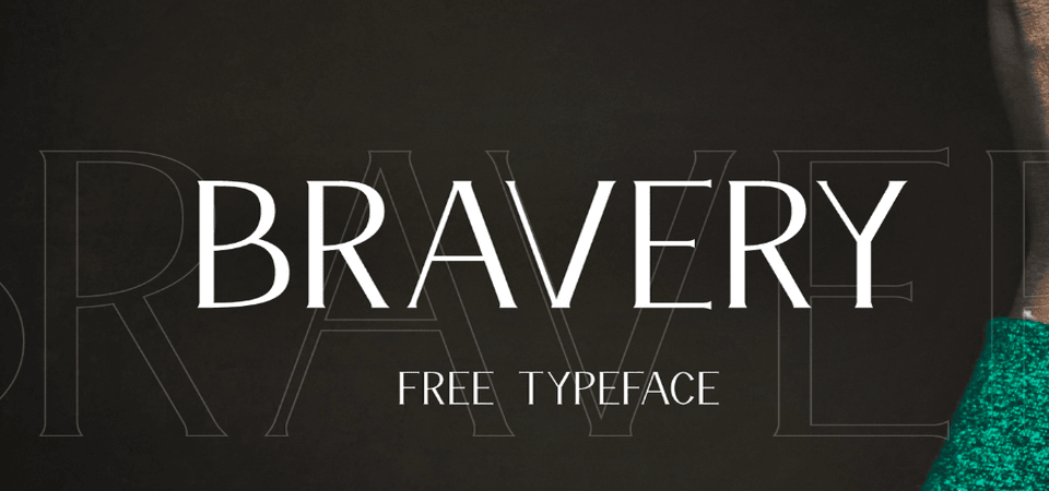
Bravery
Bravery is fresh free font available on Behance developed by a qualified font developer who is capable with mock-ups.
Also, the mock-ups contain fonts which are used all over with the font in their own design. The font appears in capital letters and number only which is ideal for headings as well as social media images.
Wrapping Up,
These are all about typography. Typography is an essential part of web design. Yes, your website is really incomplete without proper typography design. So, focus on typography design and make your site crowd of visitors.
