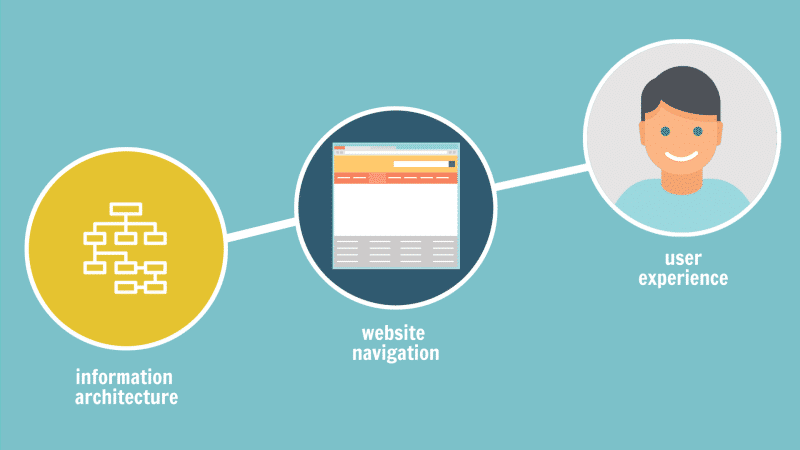
Designing the Navigation of your site is the way to give foundation to your website. If you fail to plan the foundation properly, then your website will be useless though it looks attractive. So, in order to benefit your business from the best conversion rate with improved user experience, you have to use some time preparing a useful way to make your visitor link up with your site and discover the most perceptive way of representing your business online.
To implement a proper navigation design for your website, firstly you need to understand what navigation is and the principle it holds. So, if you do not have adequate knowledge of Navigation, this article will be helpful for you. Reading this article till the end, you can get some clear ideas on navigation and utilise those ideas to run your site in an effective way.
Table of Contents
Navigation Design
Navigation design is a leading component of an online presence that makes your site successful. It is the gateway towards the various sections of content within a web page. Website navigation is essential for a good customer experience towards your online presence. It is similar to the road map to all the various parts and information enclosed on the website. Making proper use of a consistent navigation scheme from one page to another can be very helpful for the audience to figure out the navigation system of your website.
Types of Website Navigation
- Hierarchical Navigation
In Hierarchical Navigation, the structure of an online presence is developed from general to specific. This type of navigation makes your website effortless with an understandable, easy path to the complete website from any place on the website.
- Local navigation
This navigation connects with the text of the web page that links towards the other pages in a web presence.
- Global navigation
This type of navigation displays the top-level pages or sections of the online presence. It is obtainable on all the pages and lists the key content section or page of the site.
Principles of Navigation Design
Design for the audience
The basic principle of navigation design is you have to design for your audience who visits your online presence. One request, do not design the navigation to make it attractive instead design it to make it handy. Your navigation design should not only focus on your business such that employing complex categorization names is not normally understood.
Keep in mind, navigation is designed to help the audience to visit your web page without any trouble. A good navigation design makes visitors busy with your website whereas a bad navigation design takes them away.
Things to focus:
- Engage more visitors, talking with them about the way they wish to navigate the web content.
- Develop a rough navigation design at first and show it to your visitors and acquire advice from them and work accordingly.
Offer navigation alternatives
Different type of visitor visits your website with various preferences in the way they desire to navigate on the website. Thus to put up different types of visitors and their navigation needs, it is a great idea to offer various navigation alternatives. This makes your site more handy and comfortable for your visitors.
Make it simple
Most Readers desire to get the information they are looking for without any trouble in less time. Thus, make your navigation design simple which does not influence the usability of the online presence. Be sure, the navigation bar is available on every page of content. A crowded navigation area is not a good practice as readers need to be offered with least choice devoid of limiting their preferences. Arranging the content usefully is the main to simplify the navigation which will be helpful to both customers and the website proprietors.
Select an appropriate Orientation
Since the screen of a computer or a laptop is mostly in landscape form, it creates a sense to orient your navigation horizontally making it simple for sight. Nevertheless, online sites with various lists of articles are likely to go for the vertical navigation design. This can be made possible without using confusion that might have resulted when they select the horizontal orientation.
Consistency is a must
It is essential to keep the navigation design consistent all over the website. A clear and user-friendly website includes one that has a consistent navigation design to make customers recognise the format. Similar colour, typescript, category, style and position of the navigation bar need to be maintained all over the website to make visitors easy to visit other pages and find out the page they are looking for.
The navigation design should be made focusing on the users and provide them with the knowledge to visit the entire page comfortably and easily. Thus, try to make the navigation design consistent to make your audience more familiar with your web presence.
Grouping Pages & Other Items
Grouping pages and other items can help visitors find relevant content quickly and easily. By organizing pages and items into logical categories, users can navigate the website more efficiently and reduce website navigation challenges.
Navigation Menus
Navigation menus are critical for website design as they provide a visual roadmap for visitors to navigate the website. Clear, well-structured menus can improve user experience and encourage visitors to explore more pages on the website.
BreadCrumbs

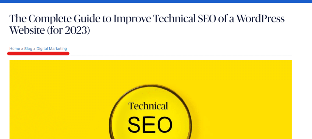
Breadcrumbs are important for web design as they provide context and help users understand their location within the website hierarchy. Breadcrumbs also enables users to easily return to previously visited pages, improving navigation and reducing confusion.
CTA Buttons
A CTA (Call to Action) button guides visitors towards a desired action, such as making a purchase or signing up for a newsletter. Well-designed CTAs can improve conversion rates and encourage visitors to take action, leading to increased engagement and revenue for the website.
Internal Linking
By providing links to related content, internal linking improves website navigation, helping visitors find relevant information quickly and easily. It can improve the overall user experience by making it easier for visitors to explore and discover related content on the website. This can also help your users gain more insights on a topic or dive deep into related content on the site.
Wrapping Up,
When you start a navigation design for a web presence you need to consider the above points. Navigation design is the key to every website as good navigation design gives a good user experience for your visitors and makes them engaged with the website you hold and the complicated navigation design takes them away from your site.
Are you looking for a freelance web developer to accomplish your project? If yes, get in touch.


