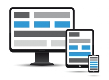
Nowadays people do not only visit different sites through their computer or laptop rather they also prefer to visit the website through the small screens of mobile devices. This indicates a website should favour both small as well as the large screen. This also helps you to improve a customer experience of your website.
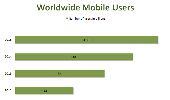
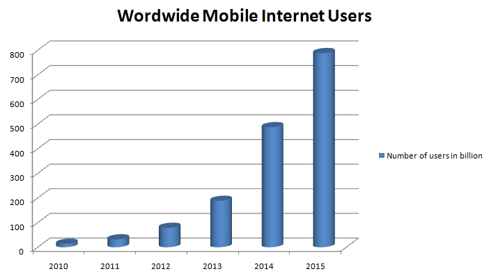
The above diagram shows that mobile users are increasing every year. Among the number of mobile users mentioned above, some of them may be internet users as well as some of them may not use the internet. Now, let’s proceed to the data that shows a number of mobile-internet users worldwide.
From the above graph, it is clear that mobile devices are very popular these days as the users are increasing rapidly. The number of mobile internet users worldwide devoid of a fixed line is expected for the number to 788.32 million subscribers. In the year 2011, more than 2.22 billion people access the internet. Thus, to make your website grow, you must focus on the mobile devices as well and while you make your web design suitable for the small screen you have to focus on the font size as well. A good-looking, with the effectual font, is the main component of a good web design. This is mainly accurate in the circumstance of mobile where the margin for error is very small as the screen is used to look for those websites.
The font styles which are perfectly suitable for larger screen may create trouble on smaller mobile screen. So if your font style works properly on the desktop, you can do this, making it fine for mobile devices as well.
Here are some of the ways to choose right fonts for small screens:
Observe how audiences read on mobile
In order to choose the right fonts for the small screen, firstly you have to observe the way audiences read on mobile. You can do this visiting different place where you can observe many people using mobile device and laptop. Now, you can understand as the screen of the mobile device is smaller, it requires to be placed close to read the word on the screen efficiently. This shows that you ought to focus on the readability, if your users can read it, your design is working well otherwise think about the fonts and make it readable.
Lighting and internet connection
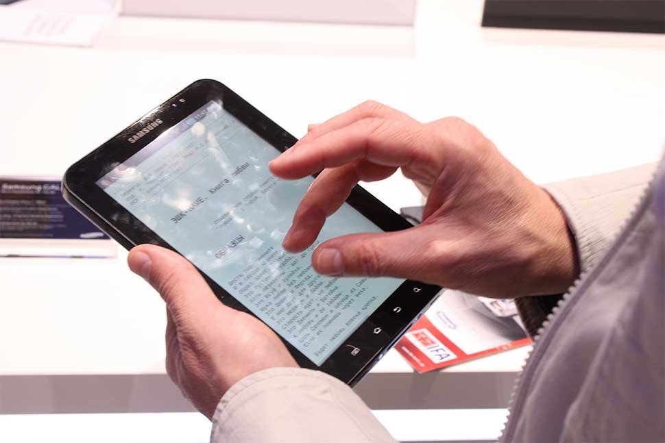
The next aspect that you need to monitor while observing the people reading on the mobile screen is the external circumstances. Lighting and internet connection are the major component. Lighting helps to evaluate how well users are capable of reading on mobile screen. While using the touch screens of mobile, a finger acts as the navigation which automatically blocks the part of a screen which is different compared to desktop devices.
Important component for responsive web font
Responsive web design fits on every device and is preferred by the search engine Google as well. By the use of responsive we design, CSS media queries can be utilised to switch the visual styles of a web page relevant to the screen size of audiences. This indicates you can create a website that is utilised one set of font style for the large screen and then regulate those styles suitable for the small screen. While developing responsive web fonts, here are some main parts to focus:
- Typography
- CSS style (alignment, size, line length and many others)
- Loading time
Desired mobile fonts
The font that you make use within your designs plays an essential role in making your website readable on mobile devices. Many web designers consist of a choice to use sans-serif fonts for the mobile website along with the application. The easy, simple, basic letterforms of sans-serifs tend to size better and develop for a readable appearance within a wider array of screen size as well as resolution.
Various fonts for various sizes
While deciding on the fonts to utilise on your website, think whether you are willing your site to utilise similar fonts over every screen size or you desire to modify the font according to the screens. If you like to use the same fonts, you have looked for both small as well as big scale. Instead, if you want to change the font selection as required, you can go with serifs or more involved fonts for large display then switch them to the simple font for the small screen.
Typographic style
Using a few lines of CSS, you are able to modify the whole appearance of the website’s text counting sizes, line height, style and many others. Each of these styles has an equal feature to make the readability of website and are essential for the mobile screen.
Size
As there are various font sizes, you cannot get the default font size used on a mobile screen, though the text smaller than 16 pixels turns out to be challenging to read for all the screens. For a mobile screen, the font size is mostly used in Ems instead of pixels, so that font size is relative, ready to respond to various screen sizes.
Line height
Talking about small screens focusing on the vertical device, line height is very essential. Line height, which performs for desktop screen might be more difficult to read on the mobile screen. Thus, the line height of at least 1.5 is a perfect to begin as it makes the reader comfortable to read.
Layout
Along with size and line height, the layout also makes a great impact on the reading experience through the mobile screen. For the mobile screen, the numbers need to be very small. You can take an example of a newspaper with an extensive attempt for line lengths of 39 words for narrow columns of text which can be helpful for narrow website columns with a mobile screen.
Alignment
The default alignment of the text of a web page is left. Most of the designer desire to adapt this alignment on the centre justified or completely justified indefinite part within the design. The left justified text on the mobile screen is mostly the desired preference. Though you utilise various justifications within your designs for the huge display, you might like to get back to left justify for a mobile screen to make it more readable.
Conclusion,
Since mobile devices are very popular these days, you need to develop a web page that fits in mobile user as well. I hope these points will make your task easy and effortless to figure out the right font for small screens. Developing a mobile-friendly website also make your business more productive with a crowd of audiences within your website. So, get benefit from your business with mobile friendly websites.
Are you willing to develop a mobile friendly website? If yes, Get in touch now.

