Tackling all projects with passion and dedication in the world of web design brings maximum conversion. Also, following some handy web design principles is a plus point.
Are you aware of those web design principles?
If not, do not worry. In this article, I will describe different web design principles to be considered to develop technically and visually efficient website.
Nobody likes to visit a boring website. Every business owner should pay attention providing the best customer experience to their site.
Healthy web design is all about influencing visitors to take an action. It is not one day work as there are lots of aspects that design comes with to attain this.
Website design might be complicated as it includes obtaining attractive design with good functionality, delivering informative contents and developing brands which should be technically fine and visually consistent.
A good web design is always forward to gratify the requirement of audiences.
The main purpose of your website is to emphasise new information and top priority. Make sure the website has good navigation design with a clear hierarchy that allows users to find the page they are looking for.
But,
Handy web design is similar to a well-built home. It might appear magnificent outside, but if it is livable, it might not be efficient. This indicates, the quality of website does not only depend on its appearance but also rely on its usability and functionality.
The design of your site is essential for conversion and you can apply any conversion improving technique in it. All the pages of your website should have a clear purpose and intention to accomplish some specific requirements of your website in the most efficient way as possible.
Along with visual design, usability and utility hold a significant role determining success or failure of a site.
Follow these handy web design principles and make your website more effective:
1. Colour
Colour plays a great role to make your site attractive. A well-researched colour surely improves the user experience. Some complementary colours consequence in balance and harmony, whereas contrasting colours for text and background results eye-pleasing experience to the readers.
You can also go for vibrant colours for buttons as it creates emotion and should be utilised carefully. Additionally, white space is very efficient, providing a modern appearance to your website.
Colours are the basic element of a good website. Back and while websites might work for a definite site such as photography website, however, it is always fine to improve web design analysing colours in a creative manner.
2. Availability and Accessibility
Availability and Accessibility are two aspects which you need to focus more and make your website rich of visitors. When a user tries to visit your website and if your site is not available then website becomes worthless. The users might go away from your site and never come back again.
Check out few basics of availability and accessibility:
-
Server Uptime
It is essential to make sure your users do not receive an error attempting to load your site. Better go for reliable web hosting service providers.
-
Broken Links
Check your website properly and ensure there is no dead links or broken links on your website. Nothing will send an audience back to Google search result rather than 404 pages.
-
Responsive web design
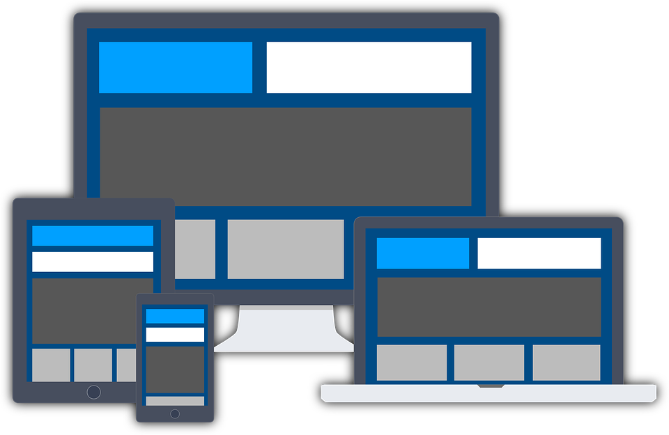
Most of the users love to explore your site from the device they hold, so ensure your site is responsive that fits well in a different screen with quick load time.
3. Visual Hierarchy
Visual hierarchy helps to develop a superior and efficient website, making users comfortable to visit the site. While designing a website, designers should recognise the significance of different types of topics and then apply them to influence the audiences providing a good hierarchical way to the users.
Here are two ways to develop a visual hierarchy:
-
Size Hierarchy
Size hierarchy is the type of hierarchy where the essential contents or images are of a larger size on the website and are followed by the second most essential contents or images in the second large size.
-
Content Hierarchy
Together with a hierarchy of size, one of the best ways to develop a visual hierarchy is developing a hierarchy of content. You can also keep content to make it noticeable to the users. This can be done by highlighting the main points.
4. Typefaces
Generally, fonts like Arial and Verdana are easy to understand online. For a good web design, make sure you pick up the font types and font size which are understandable. Do not go for fancy which might affect the design or ruin your design.
The perfect font size to make the text in the website readable is 16px and also connects with more typefaces to keep your design smooth and updated. There are lots of resources available on the internet that provides proper knowledge about typefaces, read them properly and apply it on your website.
5. Layout
Focus on a layout. For an effective web design, endeavour for stability. You definitely desire your page to become well-admired by your audiences, so make them attractive with eye-pleasing and background, colour scheme, navigation design and many others.
You can also place a rich set of links on your website. There are numerous ways for your visitors to navigate your site. Think about an important home link or icon on every page.
Better highlight links in a textual material to related information anywhere on the website. Make sure you do not hide essential information as audiences do not want to click multiple times to explore the information they are looking for.
Wrapping Up,
These are some handy web design principles that every business should know. Web design includes an idea of planning, developing and maintaining the site. Designing the site creatively together with updating and maintaining it regularly makes the site fresh and effective. Following the handy principles mentioned above surely takes your website to the next level.
If you are looking for interactive web design in Sydney, Nirmal web studio is always available for help.
