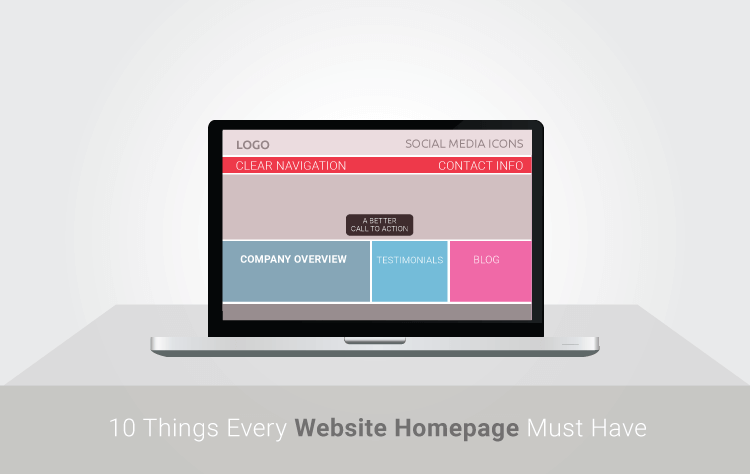
The homepage of your website is the first place where every visitor will land in. It is the first thing any visitor will notice or the first impression they will ever have of you. And you know very well how important the first look or first impression is. Research has shown that a visitor spends maximum of 8 seconds on the site and decides whether to stay or leave. And you have got exactly 8 seconds to create a good first impression and entice your visitors to stay and explore your site.
Table of Contents
- A Proper Brand Identifier
- Social Media Integration
- Contact Info
- A Better Call-to-Actions
- Proofs
- Benefits and features
- Supporting Images
- Awards, Certifications, or Associations
- Blog Highlights
- Bonus Section
Is your website homepage making a good first impression?
In order to help you to improve the performance of your homepage, we are here with “10 things every website must have” tips. These tips will not only ensure your customers have a positive experience but, it will also be a great help in improving your company’s digital footprint.
A Proper Brand Identifier
A logo plays a huge role in a company’s branding strategy. It is a major graphical representation of a company’s brand. The logo is basically the face of the company’s brand and the first visible manifestation of the company website. So, it is most important to have a unique and clear website logo that represents your brand at a glance. In order to make it easier for your visitors to know what type of website they are visiting, include your website logo at the topmost part of your website. The standard format to place a logo is at the topmost left side of a website. With your company’s logo, add a great business tagline if you have any. A clear value proposition might sound less important to you, but, if you really want your visitor to stay on your page then, you should create a clear value proposition related to what your business does. Think your logo is outdated? Redesigning a logo is important to reignite your brand.
Social Media Integration
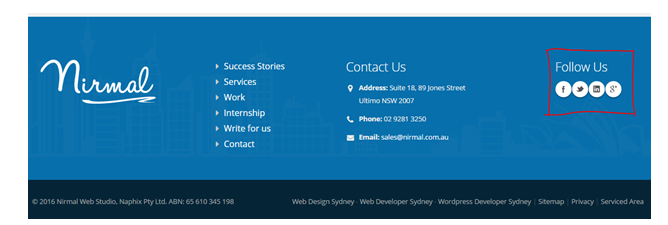
Social media is a critical part of any business marketing strategy and have become a great platform to promote your business and increase leads and followers. We all live in a digital world, where people are found increasingly driven by social media sites and their activity. According to a report by HubSpot, more than 73% of consumers expect a business to be on social media and are more likely to show interest in those businesses that respond to them online.
Social media platforms like Twitter, Facebook, Tumblr, LinkedIn, Google+, Instagram, Youtube, Pinterest, etc. are gaining popularity for business marketing day by day. And if you want to see an increment in the number of followers and engagement with your company on your social media, then, integrate those social media platforms into your website’s homepage where it can be easily visible to your audience. This will not only give your audience a choice to connect to you easily whenever they want but it will also help boost your SEO. The best place to integrate your social media icons is the header and footer part of your website as shown below.
Any website best serves its needs when it can be seen. We offer Brisbane SEO services to help you rank on #1 position of search engines result page. Contact us now.
Clear Navigation

Like a map is useless without a legend, a website is totally useless without clean and clear navigation. The design of the navigation of your websites plays a huge role in user satisfaction and engagement, the website traffic and search engine rankings. Navigation should be easily understandable by your audience and help them explore your website each page and content easily. While developing custom WordPress features may increase the overall website development costs, professional web design will definitely make a difference.
Include standard style navigation (horizontal navigation across the top or vertical navigation down the left side) which is easier and user-friendly. Make sure to include accurate navigation titles for internal pages of your site like about us, contact us, faq, services, blog, etc. Showcase the most popular page of your website visited mostly by your audience to the forefront. Don’t forget to check whether the links in your navigation are working properly or are broken. A better call-to-action is an important thing you would like to consider while you are developing your navigation strategy.
For more navigation design tips, visit Useful Principles of a Navigation Design.
Contact Info
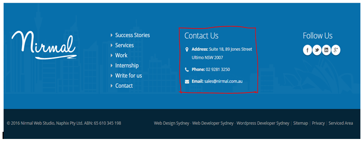
Suppose, a visitor landed at your homepage and wanted to have a business discussion with you but, they couldn’t find the means to get in touch with you. How frustrating would be that for user experience and your business? You will eventually end up losing a potential client for your business. One should never forget that contact information is the most crucial business detail. You should make it easier for your visitors to find your contact information easily on your homepage so that they can contact you immediately whenever they want. The most common place to place contact info is in the footer of your website. It may include information like your email address, mailing address, form and phone number.
Placing information like this assures your potential client about getting a hold of someone who could be in touch easily. While placing contact info, make them clickable and easily copied. If you don’t want or have time to answer calls then, you can place a company email and mention how long it would take for you to get back to them. Getting a company email makes you look more professional. The best practice nowadays is to include a contact form where you can collect information from the person and can filter easily which emails to reply to. Keep the form short as people might get irritated and get lazy to fill up long forms. The short form may include the person’s email id, the product, and services they are interested in, how can you help them and from where they heard about you, etc.
A Better Call-to-Actions

The primary goal of a homepage is to attract visitors, keep them browsing your site and try to turn them into your customer and generate leads. So, design your homepage in such a way that, whenever a visitor lands on your homepage, they get ideas of what action to take by just browsing your page themselves. Include primary and secondary visually striking call-to-actions on your homepage that direct your visitors to do the things you want. Including more than that may provide too many options for your audience and confuse them, so don’t overdo it.
Before designing CTAs, you should be clear yourself, about what action you really want your audience to take. Do you want them to fill up a form or do you want them to register for an event? Do you want them to subscribe to your newsletter or do you want them to learn more about your products and services? Optimise your CTAs as per your need and limit the copy brief to no more than five words. For example, “Request a Quote”, “Sign Up”, “Register for Free Trial”, etc.
Proofs
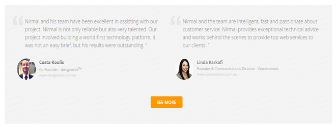
A client testimonial is the most powerful indicator of trust. It is the most effective way to humanise your company’s brand and reassure your potential client that your business is genuine and that the products and services provided by you are great and liked by your other clients. According to the survey launched by Bright Local, nearly nine out of ten consumers read online reviews and more than 88% say they believe in those reviews and testimonials. They have complete trust in those testimonials and more than 67% of consumers prefer to read 6 or fewer online reviews and testimonials.
If you have been providing high-quality services and products to your clients and have succeeded to make them happy with your services then, why not invite your clients to share their experience with your business or website? No matter how much you claim your products and services to be the best, people will hardly believe it because there are millions of businesses online and all of them claim to be the best of each other. Rather, they will believe in other people’s reviews of your services and products. So, include just a few of your best testimonials by your client on your homepage. Note that, the testimonials should sound genuine, and avoid too much polishing.
Benefits and features
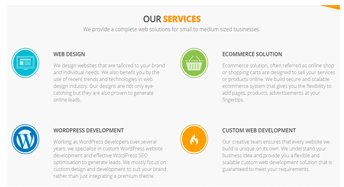
First of all, identify the key features that differentiate your business from your competitors and find the best services and products that your company offers. It is not only important to describe what exactly your company does but, it is also very important to describe why what your company does matters. Most of the users, both online and offline want to know what benefits they are going to have from you and why should they choose you for the service or product. You should be able to compel them to stick around.
A homepage will already have tonnes of content, so avoid going into details. The best thing to do is choose the right and best words and give a short overview of your company. Include the main features of your company and the benefits your potential clients could have from you in that overview. Don’t forget to include your keywords within the content. Also, add a “read more” or “learn more” link which will redirect them to your company’s About Us page.
Supporting Images
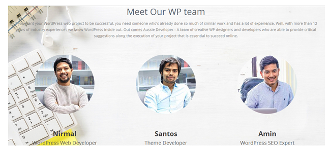
This is a world with visual culture, where most people are visual. They prefer to see visually appealing images on anything. Many of research shows that images are the best way to attract and get people more connected to your site. People prefer real images rather than stock images. You must make sure that the image you are using clearly indicates what you offer and totally matches your website theme. Use high-quality images only, poor resolution images are disastrous completely avoid them.
Include high-quality real photos of your team members if possible, they are found more realistic to portray your company’s image and show your professional side. You also need to consider your mobile users, so use high-quality images that have a reduced file size and don’t forget to add alt text to your images.
Here’s a list of 99+ amazing sites to land Free royalty-free stock photos online.
Awards, Certifications, or Associations
It is time to showcase the awards, certifications or any associations that you have received to your existing clients and potential clients online. Why not take a little advantage of the hard work you have done and the recognition that you have received in your industry or business niche?
Awards, certifications or any other associations, speak a lot about the quality of your work to the world you. They not only help you to build an image of a trusted business partner but, also help you to gain the interest of more potential clients. So, make good use of this powerful client-attracting weapon on your site’s homepage.
Blog Highlights
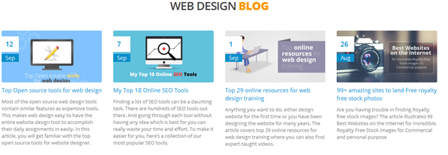
Content marketing plays a huge role in pleasing both your audience and search engines like Google. A great content marketing strategy always includes a blog in it. A blog can be a greater medium to communicate with your audience, gain more followers and visitors and drive more traffic to your website. It is the heart of your content marketing strategy, so promote it wherever you find an opportunity, be it the homepage of your website. Make it easier for your audience to find the latest blog post by placing them on your homepage. Lots of website owners are found to include their blog section on their homepage, which has not only helped them get more visitors but also helped them to improve their search engine rankings.
Lastly, if you don’t have any section left where you could promote your blog then, the footer of your homepage can also be a great place to prioritise your blog. It can be a great place to either show a feed of new posts or to have a CTA prompting visitors to visit the actual blog or subscribe.
Bonus Section
Services & Value Proposition
Your homepage must be able to communicate the services or products you offer, why should your customers choose you and what you offer differently. The homepage usually makes the first impression for your website visitors and you should capitalise on this opportunity to make this impression the best one.
Resources
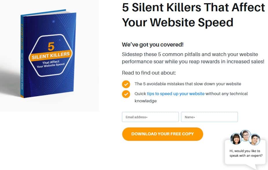
Another thing you may want to keep on your website is the resources. These resources can be in different formats and may differ according to your service area or industry. For example, if my firm offers Website Security Services, I could offer a PDF checklist to keep websites secure as a resource.
Offers & Promotions
If you have any running offers or promotions, what better place to keep them other than your homepage? For most websites, your homepage is the page that gets the maximum clicks and visits so that is why you might want to consider promoting your offers through your homepage.
Videos to tell a story
Do you have an inspiring story to tell your customers? Stories of your previous clients benefiting from your services. This can be done in testimonials sections but adding a separate section for video testimonials can surely help. You can also include processes to get started for your probable customers and how they can use your services or products.
Does your website’s homepage have all of these elements?
If your website does not have all these elements mentioned above, now is the time to consider redesigning your homepage. As mentioned earlier, a homepage plays a vital role in making the first impression which is surely going to last forever. You literally have got few seconds to impress your visitors and make them stay and explore your site more. So, following the above key guidelines for designing a user-friendly and search engine-friendly homepage is well worth the investment.
If you need help optimising your current website’s homepage or designing completely new website, then contact us today!
